Leiden cholera epidemics mapped out, literally


Three cholera epidemics struck 19th-century Leiden. Today’s coronavirus pandemic prompted Martijn Storms, curator of maps and atlases at the Leiden University Libraries, to scour the library for maps about these past epidemics.
“As a child I was always poring over my parents’ atlas,” says Storms. “That was the Winkler Prins Family Atlas from 1974. It is now on my bookshelf, looking somewhat the worse for wear.” Storms’ fascination for maps led straight to his present job at the University Library, stopping only to take in a degree in Social Geography and Planning, and a specialization in GIS/cartography, on the way. He has been in his present job for 14 years now.
Cartographic images of complex data
Cholera outbreaks struck several cities in the Netherlands in the 19th century, including Leiden. Storms saw how mapmakers struggled to aggregate the complex data gathered about the disease, for instance about its temporal and spatial distribution, into a clear cartographic image, a problem mapmakers still face today.
The current coronavirus pandemic has led to an “infodemic,” says Storms: “A huge quantity of information is visualized in a huge quantity of maps, but this is not always according to basic cartographic rules. A common mistake is to use absolute numbers when you should be using relative ones. Good maps use proportional circles to show the number of infections or calculate the number of infections per 100,000 inhabitants for each counting area.”

Thematic mapping
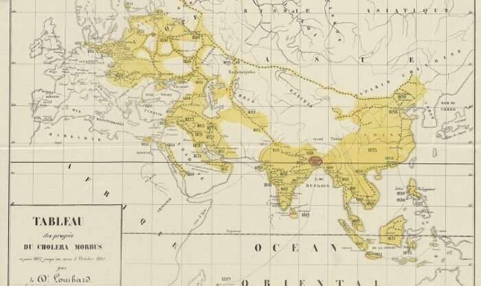
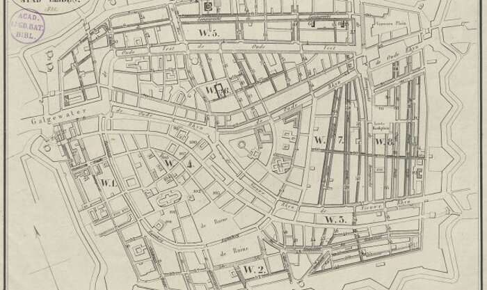
Geographical maps have been around for a long time, but the desire to map thematic information also goes back centuries—as do opinions on what makes for a realistic picture. Storms: “Thematic cartography developed especially quickly in the 19th century. One reason for this was the cholera epidemics that came in waves during that century.” Originating in India in 1817, Cholera Asiatica or Cholera Orientalis spread to Russia and reached western Europe in 1831. The first case in the Netherlands was diagnosed in Scheveningen at the end of June 1832: fishermen had brought the disease to the Netherlands from England. In the same year, more than 10,000 people in the Netherlands died in this epidemic, especially in the cities in the densely populated western part of the country. Storms: “We have town plans of Leiden, Amsterdam, Gouda, Groningen and Scheveningen that relate to the 1832 cholera epidemic.”
The first cholera map from 1832
The map of Leiden from 1832 shows four classes of cholera infection: white for streets and neighborhoods that were unaffected, lighter shading for those with a few infections, darker shading for those with more infections and black to signify the areas that were hardest hit. “These were dead-end alleys and slums where the poorest inhabitants lived in unsanitary conditions,” says Storms.
The map was published in the book “Geschiedverhaal van de cholera-epidemie te Leiden in 1832,” written by three doctors from Leiden and published in 1833 by C.C. van der Hoek. Storms: “This is one of the oldest thematic maps to show the spatial distribution of the epidemic in Europe and probably the oldest of its kind in the Netherlands.”

The 1866 epidemic: Leiden and Amsterdam
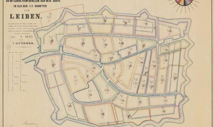
Cholera continued to lurk, and led to a big outbreak in the Netherlands in 1849. Much to Storms’ surprise, no maps can be found of this. The opposite is true for the next outbreak, however, in 1866. The printed map of the distribution of infections and deaths in Amsterdam, compiled under doctor Isaac Teixeira de Mattos, is well-known. Storms: “What is less well-known is that Leiden city architect J.W. Schaap compiled, in manuscript, a similar map of Leiden in the same year. Which of the two mapmakers followed the other’s example is unclear.” The single known copy of the Leiden map, kept at Leiden University Libraries, shows the division of the city into 39 neighborhoods.
The same problem
It is clear that both mapmakers struggled with how to bring together the spatial and temporal data about the disease into one clear map. “Although the maps look colorful and contain a lot of information,” says Storms, “they fail to communicate the data in one clear image. The symbols are not proportional and the colors chosen for the consecutive weeks lack a clear order. However, both Teixeira de Mattos and Schaap related the number of deaths to the number of inhabitants per neighborhood, expressed in a number per 1,000 inhabitants.” The Leiden map is accompanied by a table and a chart, in which the temporal spread of the epidemic is clear to see. The first death was on 4 May 1866 and the epidemic had reached its peak in June.

The detailed map from 1869-1874
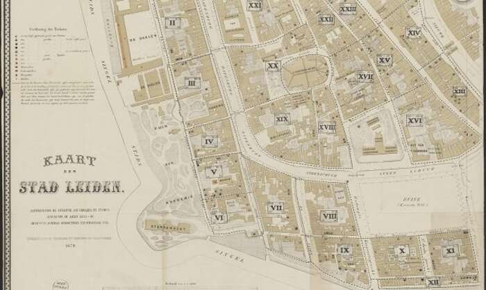
In contrast to the Amsterdam map, the Leiden one from 1866 was not printed. According to historian Heleen van der Weel (1999), the initial intention was to make a lithograph of the map, but another map was published soon after, by the Vereeniging tot Verbetering der Volksgezondheid in Leiden. This map shows the cholera and typhus deaths for the period 1853-1869. Black (cholera) and red (typhus) symbols indicate the number of deaths per address. Storms: “That would no longer be possible because of data privacy.”
“Accumulations of harmful dirt”
Source: Read Full Article